Case Study: Lake Forest Park Midcentury Modern Kitchen Remodel.
- Nov 21, 2025
- 4 min read
Updated: Apr 22

1. Project Overview
Title: From Cramped and Dated to Open-Concept Culinary Haven
Client: young family of 5
Location:Lake Forest Park, WA
Project Type: Full Kitchen Remodel & Structural Modification
Duration: 6 months
Style: Midcentury Modern
Budget Range: $$$ - Mid to High-End
2. The Challenge: Outdated Function and Limited Space
The clients, a growing family of five, desperately needed a kitchen that matched their busy lifestyle and will be a great place where they can get together.
Key Issues Identified:
Poor Flow and Function: The existing kitchen was a classic 1980s layout—dark, isolated, and separated from the living area by a large, non-load-bearing wall.
Inadequate Storage: Original cabinetry was inefficient and couldn't handle the demands of a busy household.
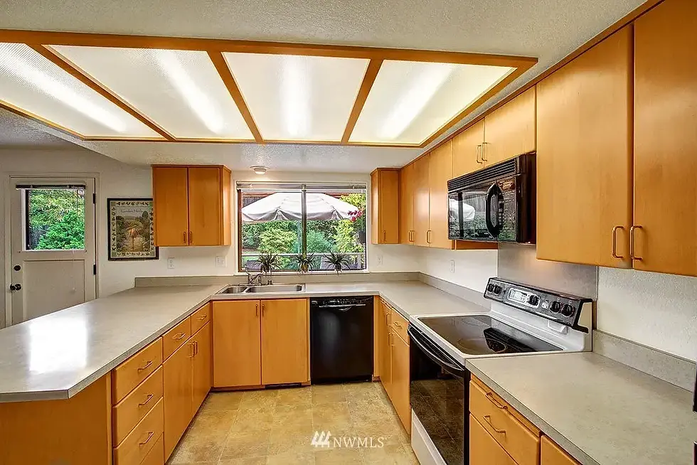
Dated Aesthetics: The room featured yellowing laminate countertops, outdated oak cabinets, and linoleum flooring.
Lack of Natural Light: Fenestration limited light penetration, making the space feel perpetually gloomy.
Client's Primary Goals:
Create an open-concept flow to the adjacent dining and living areas.
Maximize storage with smart, modern solutions.
Incorporate a large island for prep work, casual dining, and socializing.
Achieve a bright, airy Midcentury Modern aesthetic that will accentuate the architecture of their home.
3. Our Custom Solution & Design Strategy
Our approach focused on structural changes and strategic material choices to maximize light and space while delivering the requested aesthetic.
A. Structural Redesign (The Game-Changer)
We successfully removed the dividing wall] to merge the kitchen and dining room removed the ceiling drop and exchanged location between patio door and dining room window. these changes ensure a seamless, unobstructed transition between different functions and allowed better storage planning.
.
B. Layout Optimization
The Island: We designed a [e.g., 8-foot-long] central island featuring asolid oak butcher block countertop, ample seating for four, and integrated storage on both sides.
The Workflow: The new layout follows a classic "work triangle" but incorporates zones for baking, coffee/beverage, and cleanup, improving efficiency.
The Beverage Corner - we utilized an existing structural wall niche as a beverage center good for everyday life and entertainment purposes

C. Material & Finish Selection
Feature | Selection | Rationale |
Cabinetry | Flat-panel doors in two tones: matte light blue-gray and off-white. | Creates a clean, minimalist aesthetic while the dual tones add depth and visual interest. |
Countertops | Dekton in 'Sabbia' finish, paired with a solid Oak Butcher Block island top | Provides an ultra-durable, maintenance-free surface with the subtle texture of the 'Sabbia' color, balanced by the natural warmth of the wood island. |
Backsplash | Dekton in 'Sabbia' finish | Offers a neutral backdrop that complements the cabinet colors and emphasizes texture over pattern. |
Flooring | Light oak engineered hardwood | Extends from the living area to unify the open space, characteristic of Scandinavian design. |
Hardware | Minimalist wood knobs and integrated finger pulls | Maintains the sleek, clean lines while adding a cohesive, earthy accent that ties into the natural wood features. |
4. Key Design Features & Storage Innovations
This remodel wasn't just about looks; it was about vastly improving daily life through smart features.
Architectural Woodwork: A custom-built slatted oak veneer enclosure was used to frame the range hood, matching to the cabinetry trim and adding a significant architectural feature and textural warmth.
Plumbing Fixtures: The main faucet features a warm copper finish, providing a striking metallic contrast against the light countertop and backsplash.
Optimized Storage Solutions: All interior cabinetry was designed with smart storage in mind, featuring adjustable shelving, integrated pull-outs, and deep drawers to easily adapt to the family's changing needs over time.
Work/Study Nook Extension: The kitchen's aesthetic and flow were extended into an adjacent dedicated work/study room, allowing the entire living area to maintain visual cohesion and high functionality.
Textural Layering: The inclusion of a woven-look wall covering throughout the main kitchen and extension areas introduces a crucial layer of visual texture. We maintained visual continuity by using the same woven pattern in a lighter, complementary shade in the adjacent work/study nook, ensuring a cohesive design across functional spaces. Its muted, variegated tones perfectly harmonize with the Dekton countertop, elevating the aesthetic beyond simple flat surfaces.
Lighting Design: We implemented three layers of light: Ambient (recessed LED), Task (under-cabinet LED strips), and Accent (lollypop globe pendants over the island and matching wall sconces in the dining area) to ensure versatile and balanced illumination.
5. The Transformation: Before & After
The "Before" Story: The original kitchen felt dark, disconnected, and claustrophobic. The clients often felt cramped when two people were cooking at once. the low ceiling and the dark finishes absorbed all the natural light
The "After" Story: The new space is defined by its dramatic openings, allowing light to flood the entire space. The new layout complies with a more intuitive, human-centric workflow and the island serves as the central hub for the family, making homework, entertaining, and daily meals a fluid experience.

Ready to transform your own space?
Inspired by this project? If you're ready to make your dream kitchen a reality, call us, we can help!


Comments